

Shopee : add a comparison feature
Speeding up users’ ability to make informed purchases by simplifying the comparison shopping process
With 125 million visits per month, Shopee is Indonesia’s most visited online marketplace. Despite their popularity, buyers find it hard to decide which product to purchase and who to buy it from when faced with similar products. To help them easily discover authentic products and sellers, I designed a feature that lets them compare two products side by side.
PROJECT SCOPE
My Role
UIUX designer responsible for all user research, wireframing, prototyping, testing, and reiterations at each stage
Methodologies
SWOT analysis
User interviews
User persona
Low-fidelity wireframes
High-fidelity wireframes
Prototyping
Tools
Figma (design and prototype)
Key constraints
80 hour time limit
Adhere to Shopee’s branding
Focus on mobile
USER RESEARCH
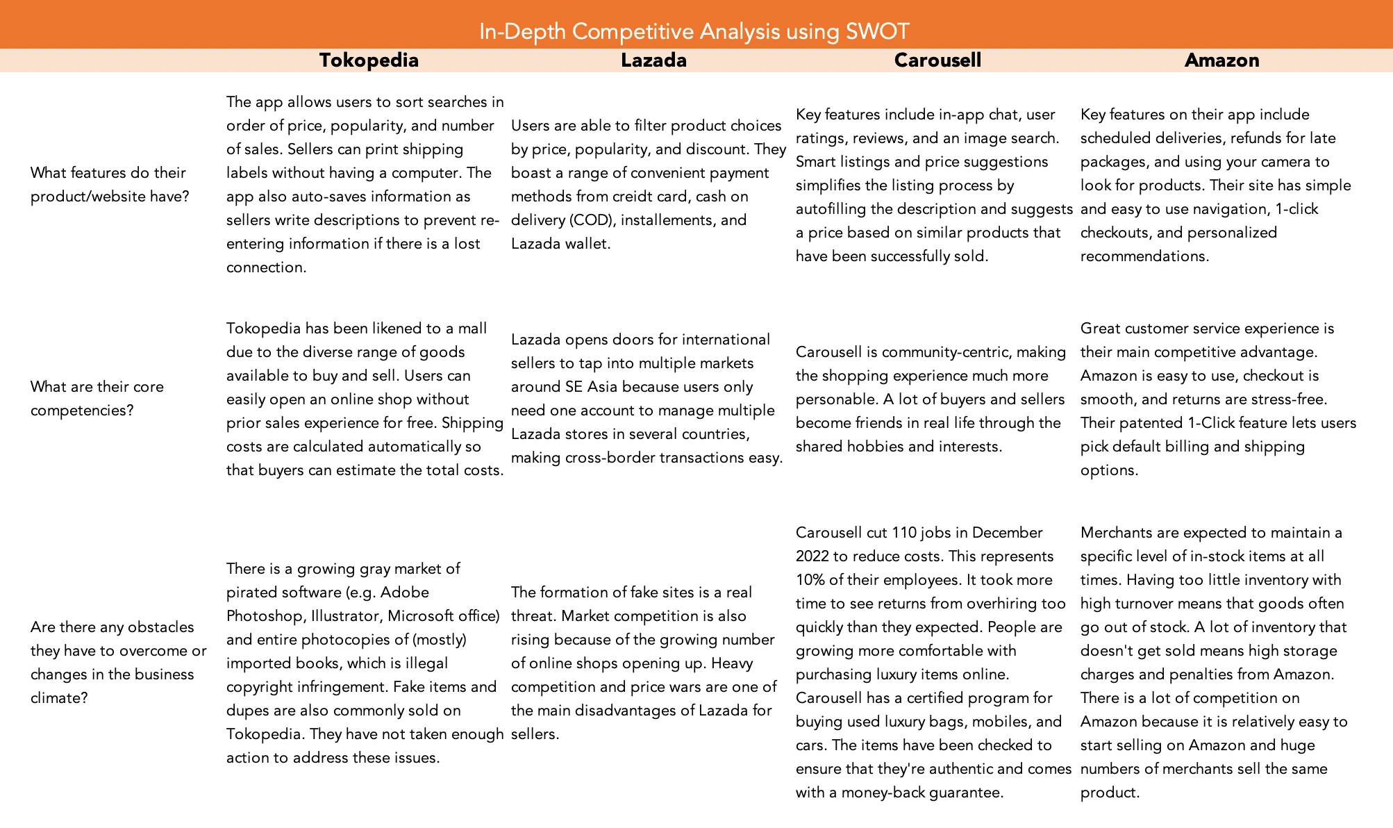
To start user reserach, a SWOT analysis revealed that Shopee’s competitors’ best features saved the users time.
We could also take advantage of two key weaknesses :
The grey market of unofficial goods such as pirated software and photocopied books is growing. Users want to know that they are buying the real deal.
The low barrier to entry makes price wars a problem. Many sellers sell the same items that it can be challenging to determine which seller is reputable.
I conducted 5 user interviews, going in with the assumption that users wanted to save money as they shopped for original products.
Participants
Ages 27-33
Single, no children
Above average income for their job positions
Two dominant themes that emerged were comparison shopping and discounts.

Users didn’t have a problem saving, though discounts made them more likely to buy. Their main problems revolved around product discoverability and comparison shopping.
A lot of sellers sell the same or very similar items
Users are not only looking for a good deal in terms of price but in terms of a seller’s trustworthiness, product authenticity, and returns
Users needed to see social proof such as reviews or “official” store badges when making an informed decision on who to buy from
Based on these key insights, I came up with POVs to articulate the problems and HMWs to start thinking of ways to solve them.

My persona, Zoey, served to remind me that although I use Shopee, I am not the audience this feature is being designed for.

IDEATION WITH SCAMPER METHOD
The chosen idea is a feature to improve the visibility of cart items and search results.
At first I used SCAMPER in combination with rough, hand sketches, to get all thoughts on paper regardless of how good they are and not feel too precious about the first idea that comes to mind. However, trying to keep sketches neat hindered my ability to freely generate ideas. I attempted the exercise again using words, which was more effective in helping me pick a solution that solves multiple problems with minimum downside.
It was important to keep in mind that one change could affect the rest of the platform in big ways, which we would like to avoid.

LOW-FIDELITY WIREFRAMES
I refined the ideas into a solution : a compare button.
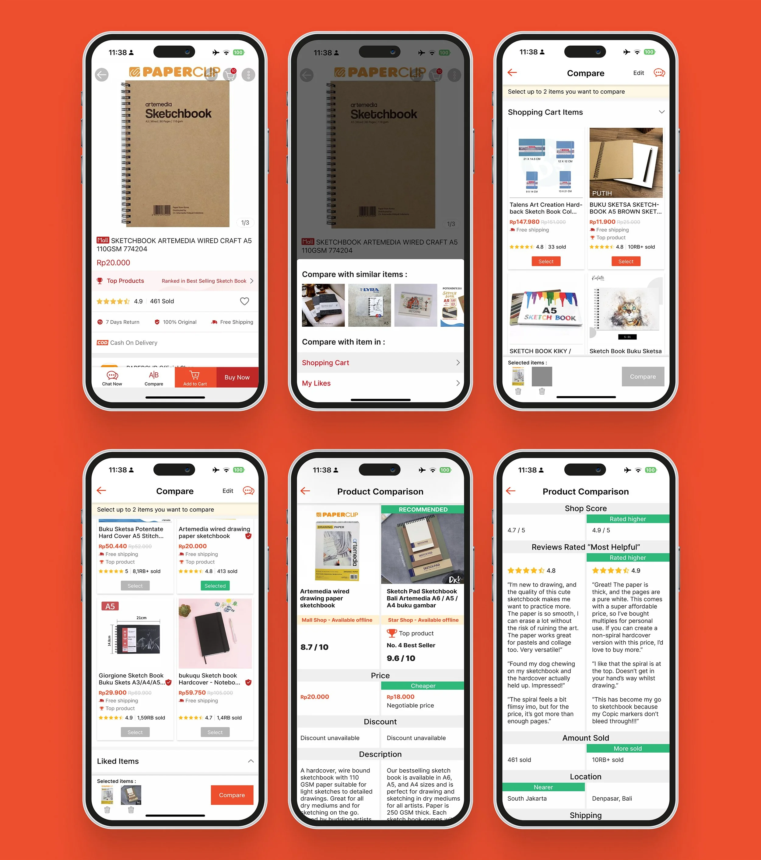
The compare button enables users to go to a product page and compare that it with another from their shopping cart or wishlist, which are already of high interest to them. Factors being compared are presented side by side. Its goal is to make comparison shopping easier so they can come to a purchasing decision faster.

Stakeholders feedback :
Comparisons should be done side by side so people can scroll vertically to read content quickly and in a natural motion.
The compare CTA should say “Compare”. Avoid using only an icon to represent “compare” (not universally recognized yet).
Make sure text inside cards are readable. It is hard to fit much text on cards arranged in columns of three.
HIGH-FIDELITY WIREFRAMES
“Before” images represent earliest versions of main screens with the compare feature.
Because I am following Shopee’s branding and design guidelines, I worked with screenshots to save time.
Make the visual hierarchy of buttons clear so users understand what is prioritized
In the before version, “Quick Compare” is twice the size of “Buy Now”, so users would assume comparing is more important than buying, when the opposite is true. In the reiteration, I removed the Chat button from the bottom navigation to try and find a more elegant placement for the new feature and because our users did not chat with sellers very often.

Use columns of 2 and replace tick boxes with select buttons
Information can be made larger and more readable when using columns of 2, not 3. We can increase the minimum text size from 10 pt to 12 pt and adjust the card sizes accordingly to even fit select buttons, which have a greater touch surface area compared to tick boxes.

Simplify the search results screen
Although this is not directly part of the project scope, part of our goal is to make the shopping experience faster and easier for users, and this can be tangibly done by reducing their amount of cognitive load through cleaning up Shopee’s current results page.

PROTOTYPING AND TESTING
The prototype allowed me to test the feature’s effectiveness with real users through one-on-one discussions.
I mapped the user feedback into categories of what worked, questions users had, changes to make, and ideas users suggested and translated these findings onto an impact vs effort matrix to determine what to reiterate first. Most of the suggested changes were easy to implement but high in impact because they would clear up meanings and better align with user preferences.
REITERATIONS

Add the chat button back in
I replaced the Chat Now button on the bottom navigation of product detail pages with the Compare button because very few users mentioned using it when comparison shopping. However, the testing revealed that they wanted the chat button back because they used it more than the search filter, which my users never used in real life.

Clarify micro copy that was misinterpreted during testing
Users did not know the difference between “Compare with suggested items” and “Recommended”, and some asked how those two sections differed from “You may also like” at the bottom of each product page. The final solution turned out to be as simple as changing this section to “Compare with similar items”.

THE FINAL PRODUCT
TO BE CONTINUED
If the project was to be expanded, users should be allowed to choose what features they want compared and be able to compare 3-4 products at once, especially on Shopee’s web version.
Based on user feedback, users are often just interested in comparing a few specific aspects of the product, such as storage, size, or color particularly when it comes to expensive goods such as electronics. It was challenging not to digress into a series of changes when adding only one feature. If more time was granted, I would love to observe users as they currently compare shop and have them explain their thought processes.