

Kubik : responsive website redesign
Informing potential customers of available services and how to contact the business
Kubik is the highest rated warehousing company in Depok, West Java. However, their website looked “old and tired”, visitors were missing the appointment booking form, and asking for prices through the contact form.
Through the website redesign, my goal is to inform Kubik’s potential customers about what they have to offer and how they can contact the business for inquiries and visits.
PROJECT SCOPE
My Role
UIUX designer responsible for all user research, wireframing, prototyping, testing, and reiterations at every stage. My client, Kubik provided the content and visual design elements, and we worked together on some translations into English. I obtained feedback from them at every stage.
Methodologies
SWOT analysis
User interviews
User personas
Site mapping
User flows
Wireframing
High-fidelity prototyping
Usability testing
Tools
Figma (design and prototype)
Photoshop (design)
Whimsical (sitemap and flows)
Three key constraints
80 hour time limit
Adhere to Kubik’s branding
Buildable on Squarespace
SECONDARY RESEARCH
Before starting the design process, I conducted a SWOT analysis of Kubik’s competitors, which revealed key opportunities competitors missed and their strengths we can learn from.

Key opportunities :
Pricing is one of the most asked for information from users. However, Genesis and Kawanishi does not include this on their websites. Kubik is considering adding a “value-based pricing” comparison chart that uses hypothetical values to illustrate how users can save with Kubik’s services.
3 of 4 competitors have multi-lingual websites : To remain competitive and cater to international tenants, Kubik would like an English version of their website.
Strengths we can learn from :
Genesis’ inquiry form on the landing page is the first thing users see upon visiting their site. It is easy and quick to complete, and users are informed that Genesis will protect the confidentiality of their email, which builds an initial layer of trust.
Shipper has 24 hour customer services available on WhatsApp and email.
3 of 4 competitors use their footer navigation to boost their SEO strategy.
USER RESEARCH
I interviewed 4 people who worked at companies requiring storage for perishable goods for over 5 years with the following goals :
To determine what made people show up at Kubik’s warehouse with no appointment
To discover what information people want to know about a warehousing company
To find what info communicates to them that they can trust working with Kubik
After synthesizing the interview data, several key themes emerged.
75% of participants use WhatsApp to communicate as their preferred platform. They wanted a way to call the business or get in touch directly.
75% talked about how they have or can benefit if the facility was not too hot due to the nature of their goods. They wanted to be sure that their goods will be safe from weather. Additionally, all participants asked about Kubik’s security measures.
All interviewees preferred videos over photos so they can imagine being in the actual warehouse.
Prices represent an information category that 75% of interviewees wanted to obtain, but if they aren’t provided online, they want to call Kubik to ask.
I formulated POVs and HMWs based on the key insights from the interviews to define our problem space.
How might we provide a way for users to quickly call the business or connect with Kubik through WhatsApp to make an appointment and directly ask questions?

I created 2 personas to empathize with users throughout the process.


PROJECT GOALS
Contact Kubik directly via WhatsApp
Help users decide on renting with Kubik
Find Kubik’s location to gauge feasibility of renting
The Venn diagram illustrates the interdependent relationships between the user, the business, and the content.
Restating the project goals at this point based on the user research and discussions kept the Kubik team and I aligned for the rest of the process.

Discoverable content and diversify lead sources
We then determined what must-have features must be present to create the most effective website redesign

The redesign focused on reorganizing Kubik’s existing content.
Because Kubik already provided the information they wanted on the website, the redesign focused on reorganizing that content to ensure that the content users want to find are located where they expect to find it based on their mental models. The result is an intuitive user experience with minimal cognitive load for the users.
SITE MAPS AND USER FLOWS

To visualize the pathways users could travel through the website to accomplish their goals, I created user flows for the following tasks :
Find out information related to “anti-flooding”, “anti-leaks”, and security
Book an appointment to visit
Making a call

IDEATION
Compiled mood boards that became the springboard for generating ideas when sketching
Looked at styles that aligned with Kubik’s brand values
Sketched layouts that combined ideas from multiple inspiration images
Created a minimum of three different design options.

LOW-FIDELITY WIREFRAMES
I transferred designs onto Figma, mixing ideas from sketches.
Presenting ideas in a more streamlined way prevented overwhelming my client with options. I tried to extract only the ideas matched Kubik’s values and ensured that information remains easy to find and navigate.

HIGH-FIDELITY WIREFRAMES
After Kubik approved the low-fidelity wireframes, I redesigned the UI components following their brand and visual design guidelines.
Creating repetitive components such as buttons and headers will save time when creating the high-fidelity screens.
I came up with many headers before we settled on one.
Kubik initially preferred having the logo in the middle of the header, but the feedback from group critique was that the logo should be on the left with navigation links to the right. If the logo is at the center, the links are not grouped together, which disrupts the navigation flow. My client saw the validity of this, so we experimented upon that further.

Initially, I added lighter shades of Kubik’s primary and secondary colors to their palette because maroon and raw umber brown have very little contrast between them for good readability. However, once applied to the wireframes, the light shades looked feminine – the opposite of Kubik’s values. What looks good on its own might not work in context.
Kubik suggested we use more of the pastel yellow in their original brand colors.
Personally, I was not sure pastel yellow reflected their value of masculinity either, but to ensure that I do not act on my own bias, I asked my peers for feedback. The majority agreed with me, so I discussed this with Kubik, who allowed me to experiment with other colors. Blue, gray, or black were colors that came to mind based on their brand values, but Kubik wanted to avoid using black for anything other than the text color, which was a new constraint I did not expect.

“I think the gray footer is not bad, but then the colour scheme becomes very monotone... and the colour that stands out is that maroon colour. The maroon is good but if we only get one, I’d still prefer using the brown.”

“I’d say definitely go with brown... Because our brand colours have been warm tone for so long, I can’t imagine us going with blues!... I feel the brown and the maroon are important to our brand values.”
We settled on using the original maroon and brown but with the yellow at 50% opacity.
With a much lighter yellow, we no longer needed to have a separate white color. This eliminated the problem we were having in using white for the background color of some sections because it did not contrast well with the yellow background sections, making it hard to distinguish between sections. The smallest change made the overall design look the most polished while looking good with the original maroon and brown.

PROTOTYPING AND CONTEXTUAL INQUIRY
Because people mostly scroll through the website, participants demonstrated what they would do in answer to a set of contextual inquiries to gauge the design’s effectiveness, such as :
Where would you find information on the following : 1) warehouse’s location, 2) security, 3) leakproof features, 4) potential flooding
Users need to know where to find key information because if not, they will leave the website dissatisfied - a lost opportunity for Kubik.
How will you set a date and time to visit the warehouse in person?
Users know they should book an appointment before visiting, and if they see a simple form that lets them do so quickly, they might be more inclined to fill it.
If you want to make a call to Kubik, where would you go?
Users also need to be able to call Kubik to obtain extra information because there is only so much information provided online.
The testing revealed that the WhatsApp button to contact Kubik was not noticeable. Users also did not know how to navigate back to the home page and had questions about the micro copy. The body text was not readable for users over the age of 40.
REITERATIONS
Plotting the changes to be made on an impact vs effort matrix allowed me to prioritize changes that would yield the most impact and forego that are not be worth doing.
Make the WhatsApp button stand out
Because the WhatsApp button did not include the logo or their brand green, users easily missed a must-have feature. I added the WhatsApp logo into the CTA.

Add “Home” back to the navigation links
No participants knew the Kubik logo in the header was clickable and that it navigates them back to the home page. One user looked for a house icon while another scrolled to the footer. There must be a link that says “Home” on the top header.

Increase font size to 20 pt
Users aged over 40 had to squint or get their glasses to read the 18 pt font. These users represent business owners looking for warehousing solutions, so it was important to factor in their reactions.

Edit the micro copy using terms more users will understand
Bilingual customers didn’t know the difference between “infrastructure” and “facilities” because it is the same interchangeable word in Indonesian. By changing “infrastructure” to “warehouse details”, they understand there is a difference between the terms.

THE FINAL PRODUCT
Home page
Kubik was originally inspired by vintage newspaper for their site’s design, which was why they heavily used the pastel yellow. Now that they are looking for a refreshed look, lightening the yellow gives the site a real upgrade. Another big change was removing the border around the page because it took up space that could be better used to showcase strong visuals. For example, the hero image can now span the entire width of the screen.

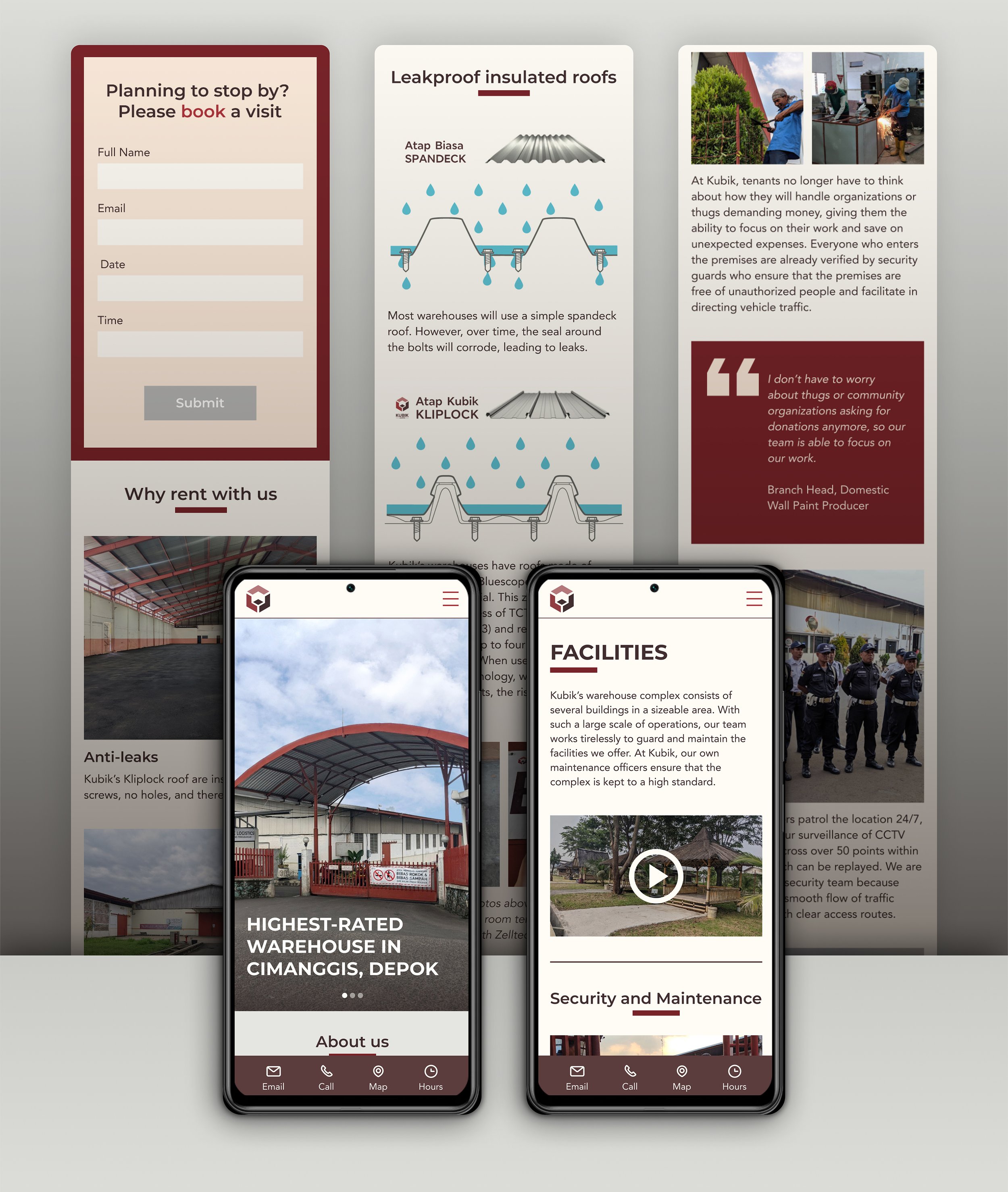
Warehouse details page
Users differed on their understanding of “infrastructure” and “facilities”, so they didn’t always find what they expected to find when they visited one page or the other. The page title was changed to “warehouse details” to prevent such errors. The first things users see on this page include a video, links that take them to specific information on the page and gives them a preview of the rest of the page’s content, and a WhatsApp button. Each detail, such as the roofs, is allocated a clearly defined section.

Facilities page
The new facilities page design follows a similar aesthetic to the warehouse details page, but the layout of imagery and text vary to maintain the users’ visual interest. The font size has been increased from the original 16 pt to 20pt, and I have incorporated bold font weights to establish a stronger font hierarchy for the new page.

Contact page
The main changes that took place between the Before and After versions includes making the form much shorter so people won’t feel discouraged to fill it out, adding a WhatsApp button to help users quickly get in touch with Kubik, and making the Google map 3 times bigger so that they can easily gauge where Kubik is located.

Mobile prototype

Website prototype
TO BE CONTINUED
Kubik has yet to decide whether or not they would subscribe for a WhatsApp chat widget.
The final prototype I presented to them only has a WhatsApp button on each page that isn’t sticky. This way, Kubik can test whether or not they really need to subscribe for the widget. If so, it will work like the prototype below.
