

Walky : end-to-end social walking app
Make new friends and discover your city by taking a Walky
Fresh opportunities await young professionals who recently relocated for a job. But months later, they still don’t feel at home. Walky solves that helping people make new friends to hangout with as they adjust by becoming walking buddies who check out local hidden gems.
PROJECT SCOPE
My Role
UIUX designer responsible for all research, visual design, branding, prototyping, testing, and reiterations at each step
Methodologies
User interviews
User persona
Card sorting
Site mapping
User flows
Wireframes
Prototyping and testing
Tools
Figma (design and prototype)
Illustrator (design)
Photoshop (design)
Whimsical (site map and flows)
Treejack (card sort)
Key constraints
12 week time limit
Figma does not support testing audio
USER RESEARCH
I began by empathizing with users with the following in common :
27-33 year old working professionals
Transitioning into their third city after receiving a job offer
Previously studied abroad
Primarily getting around on foot
Enjoys food related hangouts and wants to know where locals frequent
The goal of the research was to find out what would ease people’s transition into their new lives. Creating a research plan with open ended questions allowed for deviations during interviews, leading to answers that surprised me and proved my assumptions wrong.

Researched uncovered that my users were not homesick. The real problem involved their need to have friends and safely getting to know their city beyond tourist sites.
The problem I had in mind was not the problem that needed solving. Users did not wish to move a fourth time or move back home, which steered the project in a new direction.
“It was a lot easier this time around because you know, Michelle’s here, and you’re still like super close, my aunt’s coming here in April.”
“Once you kind of settle into your place and... made some friends... it’s very easy to feel at home already.””
“I started meeting some other people, so like a colleague from work who’s also from Indo.”
“I’ve grown to realize she’s also struggling here because she just moved. So we’re just going to hang out now”
Finny the financial consultant is a persona based on my research findings to help me identify with those I am designing for.
Finny, grew up as a third culture kid who struggles to feel as if she truly belongs anywhere. She explores her new city by walking around randomly to see what is out there and wants to meet local friends to practice the local language with, bond over food with, and learn about the culture from.
“It would be nice if you had a list or some kind of app that would tell you... less touristy but still interesting to look at places.”
“Even if I don’t have anything I want to do, I can just walk and roam around the neighborhood.”

I came up with POVS and HMWs and chose the problem, which when solved, has the most longevity by providing users with value even after settling in their new city.
POV : Finny needs to make new friends to hang out and eat with because she misses her friends and would like to have a small group to help her adjust to her new city.
HMW : How might we help Finny meet with new friends through hangouts?
PROJECT GOALS
Build real world friendships
Users bond with one another through activities and shared experiences in finding cool, non-touristy places in the new city
Personalized recommendations
Users receive a custom experience based on their selected interests and preferences during onboarding
Ensure customer retention and loyalty
Users keep utilizing the platform long after they have adjusted to their new cities and made friends through the platform
Strong branding
Improve customer recognition; users should feel personally connected to the brand
IDEA GENERATION
I brainstormed solutions to how might we help our persona meet new friends through hangouts and narrowed down to the idea of a social walking app.
The app allows people to find new friends as they explore their city together like a local, doing an activity they already enjoy (walking) while getting more acquainted with their surroundings. They can opt to play walking games to learn about their area and use as an ice-breaker when walking with someone new.


CARD SORTING
A remote card sort revealed how users would categorize items that will go on the app.
Green shows items with 60% category agreement. White shows 100% agreement.

SITE MAP AND USER FLOWS
Building a sitemap established the app’s structure and organized where content will go, ensuring crucial elements are included.

User flows illustrated how users will interact with the app’s content and navigate through the platform.
User flows helped me to determine which screens to make and roughly how many, taking into account that some screens will have multiple variations. They also show that different users will navigate the same app differently, so having multiple pathways to achieve a single task would reduce the error rate. The two key flows are :
Looking for a destination to visit and sending a friend request to ask someone to go there with
Walking to the meeting point to meet your new friend.

LOW-FIDELITY WIREFRAMES
Sketching wireframes was an inexpensive way to explore a range of layouts and solutions before adding technical details.
Through this process, I was able to provide enough information to share with others and receive feedback to guarantee that the user interface meets users’ needs from the beginning before mistakes get costly and time consuming.


MID-FIDELITY WIREFRAMES
I decided which of these sketches to transfer onto Figma, working on the mobile version first.
We can better visualize the information hierarchy there and test whether or not the correct content is being prioritized.


UI DESIGN ELEMENTS
Building a UI component library prior to high-fidelity wireframes saved time from creating repetitive elements and ensured cohesive branding.
People must understand what interface elements mean so that these elements aid them in achieving their goals. While creating components, I asked myself questions such as :
Do CTA buttons contrast well against the background?
Could users quickly distinguish the different selection states?
Did users understand the purpose of each screen?”

Walky’s logo combines the idea of a social butterfly, location marker, and footprint.
When I first began sketching logo ideas, I thought very literally about how the logo should be of a footprint, path, or shoe to match the app name. I was about to go with the logo design on the bottom right corner below because it is the silhouette of two overlapping shoes that form a location marker in the middle while their laces combine to form a friendly face. My peers thought the idea was very cute and encompassed what Walky is about. However, the design didn’t scale well.
I returned to the drawing board, this time using a grid and going for something more abstract.
The ideas for this second round are a lot simpler because I wanted to come up with a design that can be reused as part of the app’s background patterns.
Redoing a logo design that I already liked was not something I looked forward to. However, I’m glad I did it because the new logo is a lot more versatile. For example, I used the footprint shape in the logo as part of the buttons on the app.
To provide visual cues that aid users in navigating around the app, I created an icon set.
The icons are for categories that will appear on the search menu, search filter buttons, and tags that indicate the type of place or hangout someone is most keen on.
The final icons from left to right are as follows : Great outdoors, Events, Holidays, Cultural sites, and Food
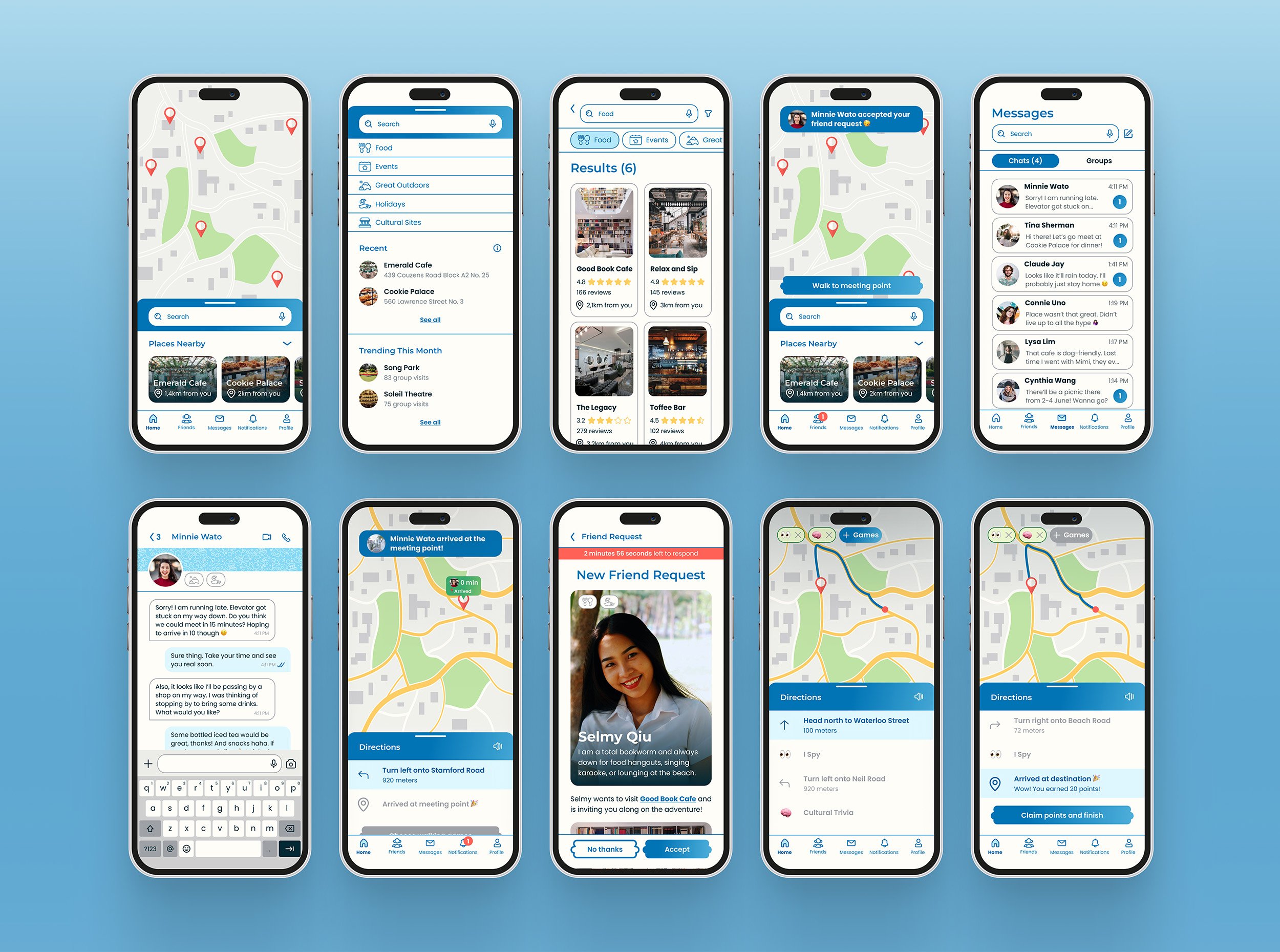
HIGH-FIDELITY WIREFRAMES
High-fidelity wireframes helped visualize how Walky would look like as a real product.
This stage ensured that the designs are not only aesthetically pleasing but also user-friendly. They were an invaluable tool at communicating to users what Walky offers.

PROTOTYPING AND USABILITY TESTING
I added interactions the high-fidelity wireframes to test how users will interact with the product in real life and gave them 5 tasks :
Sign up to create a new account
Look for a destination and send friend requests
Walk to the meeting point
Play a game while walking
Accept a friend request
Testing revealed areas to reiterate.
I discovered that the majority of my users did not click on unread notifications, which led many of them to miss the “Walk to meeting point” CTA on the notification page. The result was that they got stuck because they were confused over how to meet their new friend - a major user goal. I then mapped out the changes to be made in an Impact vs Effort matrix to prioritize reiterations with the most impact.

REITERATIONS
Make sure users know how to get to the meeting point
Users did not check the notifications page nor did they click on the pop-up notices, so they did not know when a friend request was approved to start walking together. Thus, it was important to make the meeting point CTA available elsewhere. I made the “Walk to meeting point” CTA available on the home page, where users are unlikely to miss it.

Move the description up so users know to scroll for details
Because the CTA originally covered the description of the destination, users did not know that they should scroll down and thought they were just looking at an image.

Rename page title and show that the gray “flowers” along the bottom aren’t buttons
Users mistook the gray “flower” elements as a button or an image that failed to load, not understanding that they are placeholders for images of their selected friends. In the After image, I added a sub-heading (“Review Friend Selection”) to explain the gray elements, and made the section minimizable to save space.

Include an option where people can walk without games
Some people wanted to explore their city alone, without games. Although they may not be our primary user, adding a “Walk without games” tertiary button was a small change that would encompass a wider audience.

Give users the option to skip customization steps after signing up for a new account
Users wanted to be able to skip the customization for later so that the onboarding process is as frictionless as possible and they can start playing with product immediately. They might get frustrated if the onboarding process is taking too long and abandon it midway. As a solution, I added a secondary button to “Skip for now” so the “Continue” CTA is still emphasized.

Make game answers multiple choice
People pointed out that if they didn’t know how to spell an otherwise correct answer, they would not win points for their answer. They also did not want to have to think about spelling and grammar while on the move due to the inconvenience and safety factors involved with typing while walking.

Clean up gamification screens
Users did not feel there was a problem with how the Before game screen looked like, but the gray shadings for locked steps and divider lines made the platform look cluttered. I removed the unnecessary design elements and made the font gray to indicate steps that haven’t been reached yet.

Make feedback for answers to game questions clear
Users wanted an easier way to see correct and wrong answers. Correct answers fill the game screen with green, while wrong answers are red. The After version is easier to see compared to a small check mark.

THE FINAL PRODUCT
The final deliverables are high-fidelity mobile and web prototypes.
Walky’s web presence is to get users to download the mobile app, but they can sign up for an account and browse destinations too. This ended up being a far more complex product than initially imagined, but it’s also one that has a lot of potential to be expanded upon.

TO BE CONTINUED
If I were to expand the project, I would focus on scaling the business model and implementing safety verification measures.
Local businesses can attract more customers by offering promos and vouchers that are unlocked or awarded by walking and playing games. Safety measures, such as requiring users to upload a photo of a government issued ID, might help people feel more comfortable about meeting someone new. We would also need to ensure that the Walky community is non-discriminatory and inclusive and include the option to block suspicious accounts.