
Liborrow
Borrow books from those nearby
Many people love physical books but are unwilling to spend on them because books might be too pricey, fail to meet expectations, or end up idly collecting dust. Liborrow solves these issues by allowing people to borrow, lend out, and give away books to each other.
PROJECT SCOPE
My Role
UIUX designer behind all research, ideation, visual design elements, wireframing, prototyping, testing, and reiterations
Methodologies
SWOT analysis
User interviews
User persona
Site mapping
User flows
Wire-framing
Prototyping
Usability testing
Tools
Figma (design and prototype)
Adobe Photoshop (design)
Adobe Illustrator (design)
Whimsical (user flows)
Key constraints
80 hour time limit
RESEARCH
I first examined 3 competitors through SWOT analysis.
The key finding is that all three engage the wider community to encourage reading. For example, people leave books in public places for strangers to pick up, share photos of their bookshelves, and make use of any available public libraries. A strength of these platforms worth emulating is that they make reading accessible by eliminating the cost factor and help people become open to reading books by new authors and genres.

I conducted 5 interviews with people who prefer physical books over eBooks and wish to read more without paying a lot.
The goal of the interviews was to see what problems people face regarding physical books. While I assume some reasons are that books take up space, price, or being read only once, people may experience other pains, such as the inability to access books they want.

Interview takeaways :
People were open to using second hand books.
They only bought books they are sure they will truly enjoy because most did not reread their books.
People were willing to give away books they weren’t using but wanted to make sure that they go to those who are genuinely interested in them.
After distilling the key insights from the user interviews, I formed POV and HMW questions.
Finding out ways to answer these POVs and HMWs will be the starting point for goal-oriented ideation that maintains a focus on the users’ needs.

Ava is a persona I created to capture the main information about our users so we can create the best possible user experience.

Must-have features :
Borrow books : Users must be able to borrow used books from others so that they can save money if they want to read
Lend out books : Users must know how make books from their own collection available for others to borrow so that their books can get a new life
Upload book listing for donation : Users must be able to upload information about a book they are willing to give away for anyone who is interested in taking it
SITE MAP
Creating a sitemap helped me to establish where content will go within the context of the larger app architecture so that each must-have feature has its place.
The goal is to have a site map that will make sense to users, according to their mental models. I went through 3 site map iterations before the final one below.

USER FLOWS
The user flows that showed how users will navigate the app went through 3 iterations.
There were unnecessary features I removed as the design progressed in order to streamline the number of steps a user goes through to accomplish certain tasks such as :
Finding a book to borrow
Uploading a listing to give away a book
Uploading a listing to make a book available for borrowing

IDEATION
The user flows indicated that we should prioritize sketching the home screen and borrow screen
Most of the activity will happen between these two pages. I reviewed my sketches to narrow down the designs that would become the most aesthetically pleasing and usable, and these became the starting point to develop into low-fidelity wireframes on Figma.

LOW-FIDELITY WIREFRAMES
The wireframes helped me focus on presenting what data needs to be communicated to users.
This stage was important for ensuring that each screen contains the “main idea” that Liborrow has to offer. It was fun to play around with layouts and differently sized design elements to see the platform start to come to life. I used detailed annotations to record my thought processes to refer back to in the midst of reiterations.

BRANDING AND VISUAL DESIGN
I designed a logo to strengthen the app’s branding and recognizability with users.
My ideas were inspired by silhouettes of stacked book and combinations of the letters L and B for the app name. I further developed the options that had potential to scale well and refined them on grid paper. The final design was created using Adobe Illustrator with a Fibonacci grid so that the logo will be balanced.

Blue and yellow are Liborrow’s brand colors to reflect our keywords : trustworthy, supportive and inclusive.
Blue also helps people focus, which people need to have when reading. The platform aims to be inclusive in terms of genre and towards users, and yellow is a color that represents that.

I created a UI Component Library to save time and effort when creating the high-fidelity wireframes.
The UI component library helped to ensure that the Liborrow platform has a consistent look throughout all the screens because it made updating certain elements easy to accomplish. It also eliminated the need to create repetitive design elements such as cards, buttons, text fields, and navigation bars, from scratch every time.

HIGH-FIDELITY WIREFRAMES
Users need to visualize what is being presented and understand its significance.
I failed to achieve this during the earliest versions of the wireframes because I had unnecessary details. Once the images were added onto the designs, there was too much to look at. The most important information was not emphasized and the information hierarchy was not well established.

I went through multiple rounds of reiterations in an attempt to make the user interface as intuitive as possible before adding interactions. The “Before” image are my first versions.
Make font hierarchy more obvious
By using a mix of regular, semi bold, and bold weights in gray and black, there were too many combinations of font weights, sizes, and colors. This made the font hierarchy not obvious, especially when all the book covers made the interface super rich in color and detail. As a solution, I decided to only use regular or bold font weights in black.

Remove unnecessary design elements and information
My initial screens were packed with elements and information that added to users’ cognitive load through their visual complexity. I removed the border of white space around the image of the book and divider lines that separated information. Then, I had to determine whether features such as usernames and reviews were truly necessary for the screen so that only the most relevant information gets shown to users.

Move the feature where users are able to lend out a book
On the Borrow page, I wanted people to be able to find a book to borrow but also lend out a book for others to borrow – opposite purposes for one page. After some discussion with my mentor and peers, we thought to enable users to lend a book through their Profile page because it is not an action that users will perform very often. This means that lending books should not be on the bottom navigation bar.

Narrow down the number of book conditions available
Presenting my wireframes to users at this stage revealed how many of them were unsure about the meaning of the book conditions. Users didn’t know which of the 3, “fine condition”, “fair condition”, “good condition”, was the best condition and had to remember that there were 5 book conditions on the platform. A user recommended decreasing the number of conditions down to 3 : “great condition”, “OK condition”, and “poor condition”.

PROTOTYPING AND TESTING
Adding interactions on Figma revealed what screens I missed that were required to smoothen the user’s navigation through the app.
After including them in, I tested how real users will interact with the app and accomplish their goals.
I arranged what changes to make on an Impact vs Effort matrix. The most notable themes from the test results were confusions regarding micro copy and how to lend out or donate a book. My users speak different languages which meant they had different understandings of “borrow” and “lending” in particular.

REITERATIONS
The key problem testing highlighted was that users did not know how to upload a listing to lend out or donate books.
The remaining reiterations were technical changes to the prototype and microcopy.
On the Profile page, rename sub-headings into phrases users will understand, and make sure they know there are sub pages.
Users did not expect to be able to donate or lend out a book through the Profile page. Even after they went to the Profile page, they did not know what to click because “lending library” and “donation library” are terms specific to the platform and did not exist yet in the users’ mental models. Some users thought the buttons for the “Available” and “Currently lent out” sub pages were decorative thumbnails that are not clickable. “My books” proved a much more straightforward section title, and I put arrows next to the name of sub pages to show users that clicking them will navigate to another page.

Shorten the micro copy on buttons to make the meanings more clear.
The micro copy confused users, and some buttons were too long. Simplifying the language improved the platform’s usability and eliminated questions on what the buttons meant. For example, “Suggest hand over time” takes longer to read than “Submit”, and a user asked if it meant they are suggesting a time to return the book.

Make it clear to users that they can get free books in the Donate page.
“Books up for donation” means that users can receive the book for free. However, these free books are hidden behind the tab that users missed. Additionally, “donate” is “to give away”, which is the opposite meaning to receiving. I changed “Donate” on the bottom navigation to “Free books” to solve this and removed the content for “Accepting donations”, which confused users because though informative, this tab didn’t have interactive elements other than browsing. The original purpose of having the “Accepting donations” tab was to let users know where to donate a boxful of books.

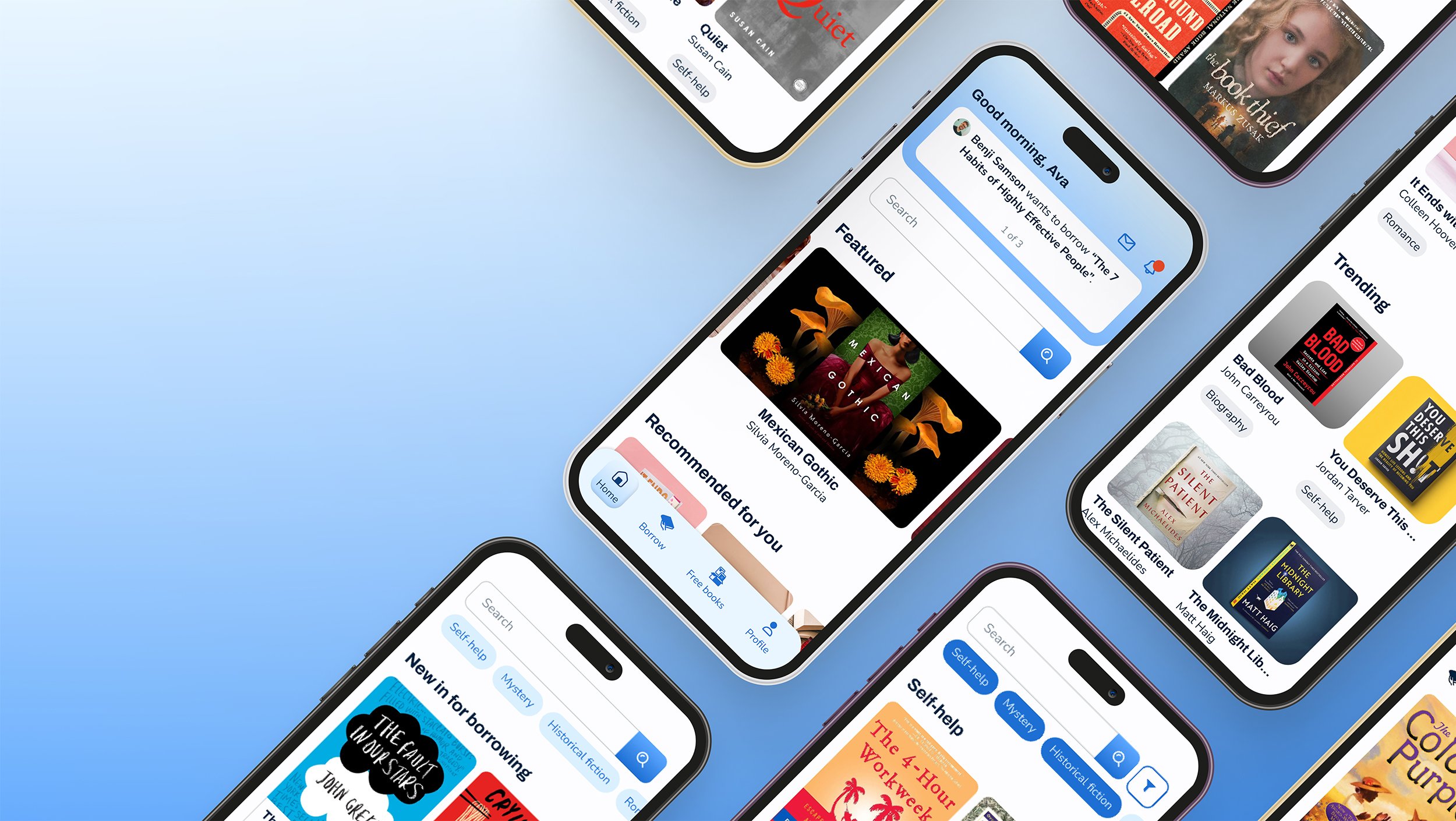
THE FINAL PRODUCT
The end prototype of Liborrow demonstrates how users can borrow books, make books available for others to borrow, and give away books.

TO BE CONTINUED
For a platform feel natural in various countries, we may need to change the tone of voice and micro copy. Illustrations and animations can also be added to raise user engagement.
I would like to explore making this app a global design, and for that to work, clear micro copy will increases the likelihood of task completion. One of my users and I had an hour long discussion on the differences between “borrow” and “lend”, which may be just one word in different languages. She was not able to complete a task due to this. Interactive visuals can give Liborrow more personality and guide users through tasks to enhance the meanings of the micro copy.